Mick Kelly's Redesign: Top to bottom redesign of an Irish pub website
CHALLENGE
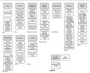
For this project, my team and I fully redesigned the Mick Kelly's website using the user-centered design methodology. The challenge was to expand the site from four pages with links to .pdf files to a sixty page site that incorporated not only their menus, but their community involvement, events, merchandise, promotions, and their catering services.
MY ROLE
Information Architect (Analyzed card sort data, created wireframes and sitemaps), Visual Designer (Designed the layout in accordance with the owner's vision), Web Developer (Lead HTML and CSS writer), and User Researcher (Created the persona task prioritization matrix, conducted competitive analysis and usability testing)
PROCESS
- Research: Competitive analysis, web analytics, met with stakeholders to learn about business goals, spoke with current customers, talked to current employees to learn about questions asked over the phone
- Created personas and a user task matrix to priortize features
- Conducted an online card sort with ten users
- Created wireframes after analyzing the card sort results
- Wrote five user scenarios and tested five users using semi-interactive prototype made in Powerpoint
- Refined the design based on usability test findings
- Mocked up the visual design and created the accompanying CSS
- Developed the site using HTML and CSS
RESULT
Mick Kelly's original site had little content. Now customers can come to the site and view menus without having to download pdf files. They can also learn about Mick Kelly's involvement in the community, what events are going on, find promotions, and more. Overall, this project was well received by the owners and by my professor. View the final design here.
This project was done for the class HCDE 537: User-Centered Web Design.
Group Members: Saul Aguilar, Paula Croxon, Jacqueline Holmes, Steve Huarte


